How to Plot a pandas DataFrame using Matplotlib
In this tutorial, you will learn how to create visuals from a DataFrame using Matplotlib.
TLDR solution
import matplotlib.pyplot as plt

# scatter plot
df.plot(x="column_a", y="column_b", kind="scatter")

# line plot
df.plot(x="column_a", y="column_b", kind="line")

# pie plot
df.plot(y="column_b", kind="pie")

# bar plot
df.plot(y="column_b", kind="bar")

plt.show()
Step-by-Step Examples
Install the Matplotlib Package
You will use Matplotlib to create plots, so go ahead and install it:
pip install matplotlib
Let's work with fish market data, which you can download by clicking here. Import it and have a first look at the raw data:
import pandas as pd

df = pd.read_csv("fishmarket.csv")

print(df.shape)
print(df.head())
The output should look like this:
(159, 7)
  Species  Weight  Length1  Length2  Length3   Height   Width
0   Bream   242.0     23.2     25.4     30.0  11.5200  4.0200
1   Bream   290.0     24.0     26.3     31.2  12.4800  4.3056
2   Bream   340.0     23.9     26.5     31.1  12.3778  4.6961
3   Bream   363.0     26.3     29.0     33.5  12.7300  4.4555
4   Bream   430.0     26.5     29.0     34.0  12.4440  5.1340
The dataset has 159 entries recording the fish species (categorical values!), its weight, three lengths dimensions (vertical, diagonal, cross), height and width.
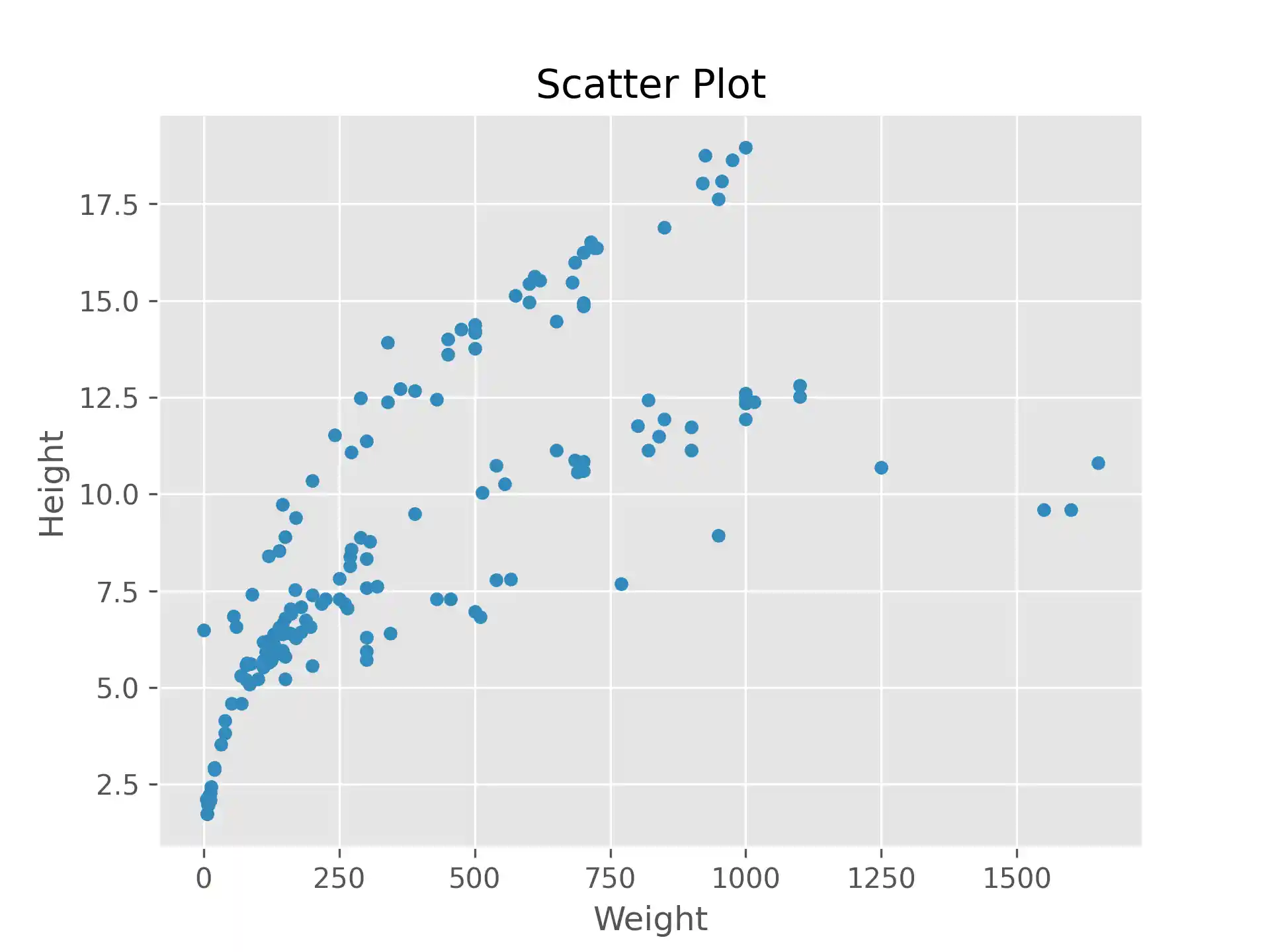
Scatter Plot
The following code produces a scatter plot with fish weigth as x-axis and height as y-axis:
import matplotlib.pyplot as plt

df.plot(x="Weight", y="Height", kind="scatter")

plt.title('Scatter Plot')
plt.show()
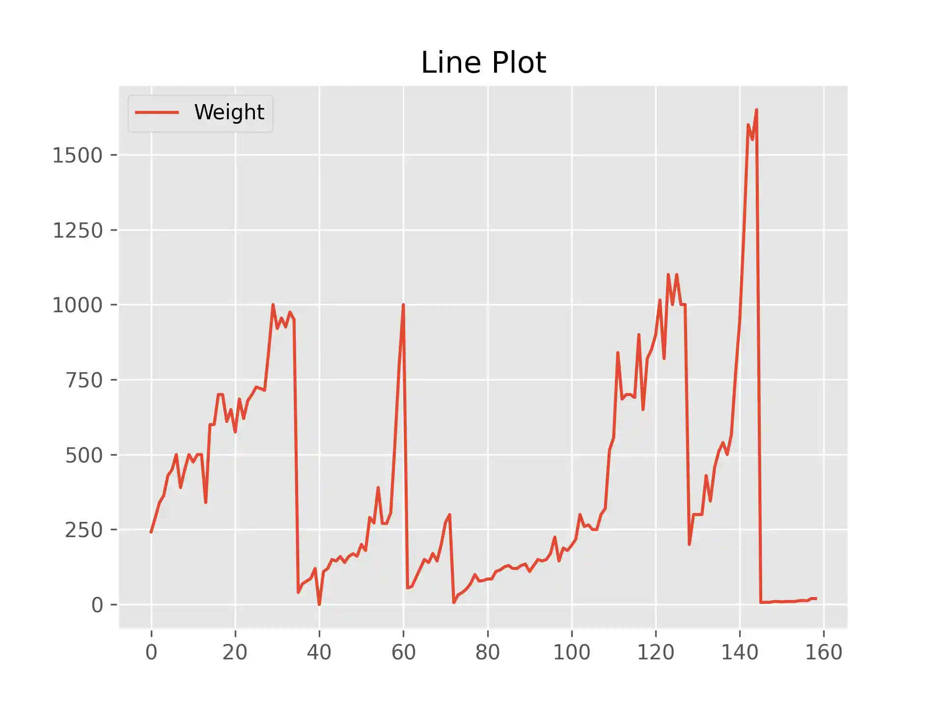
Line Plot
The following code produces a line plot with the DataFrame index as x-axis (let's pretend as if each fish was caught on a different day) and weigth as y-axis:
import matplotlib.pyplot as plt

df.plot(y="Weight", kind="line")

plt.title('Line Plot')
plt.show()
Pie Plot
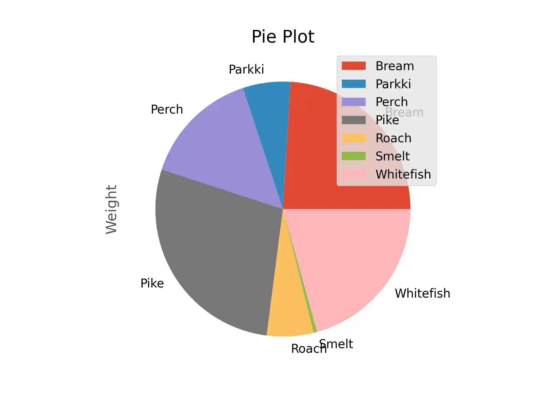
The following code (1) calculates the mean values of each column grouped by fish species and then (2) generates a pie chart based on the mean weigths:
import matplotlib.pyplot as plt

mean_df = df.groupby('Species').agg('mean')
mean_df.plot(y='Weight', kind='pie')

plt.title('Pie Plot')
plt.show()
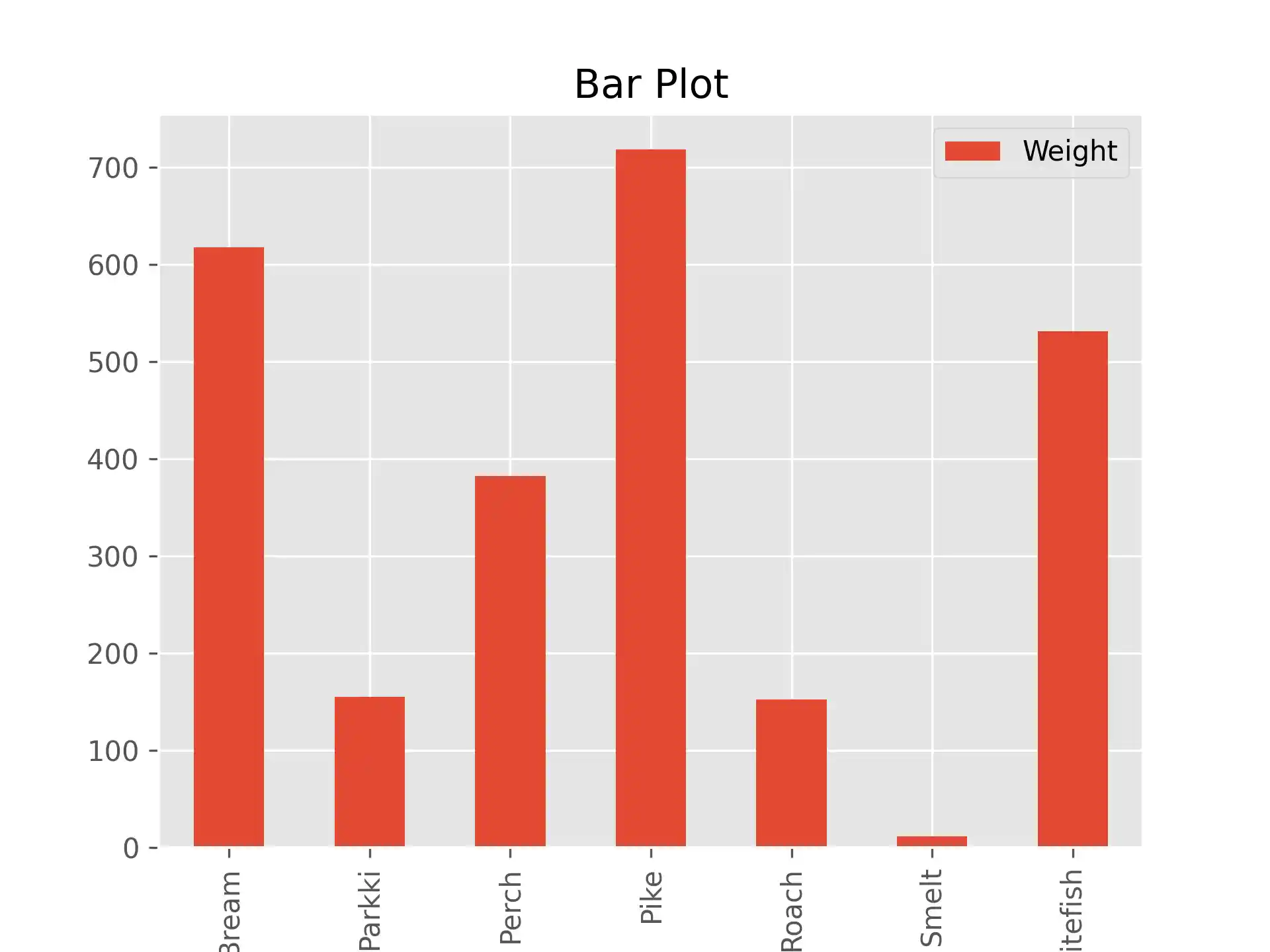
Bar Plot
The following code (1) calculates the mean values of each column grouped by fish species and then (2) generates a bar plot with fish species as x-axis and weigth as y-axis:
import matplotlib.pyplot as plt

mean_df = df.groupby('Species').agg('mean')

mean_df.plot(y='Weight', kind='bar')

plt.title('Bar Plot')
plt.show()
That's it! You just learned how to generate plots from DataFrames.