How to Place Matplotlib Charts on a tkinter GUI
In this tutorial you will create a simple graphical user interface (GUI) that holds chart.
TLDR
The following code block gives you the entire script for creating an example GUI. See the subsequent sections for a step-by-step guide with detailed explanations.
import tkinter as tk
import pandas as pd
import matplotlib.pyplot as plt
from matplotlib.backends.backend_tkagg import FigureCanvasTkAgg
data = {
"fish": ["pufferfish", "salmon", "shark"],
"quantity": [10, 100, 1]
}
df = pd.DataFrame(data)
root = tk.Tk()
figure = plt.Figure(figsize=(6, 4), dpi=300)
ax = figure.add_subplot(111)
bar = FigureCanvasTkAgg(figure, root)
bar.get_tk_widget().pack(side=tk.LEFT, fill=tk.BOTH)
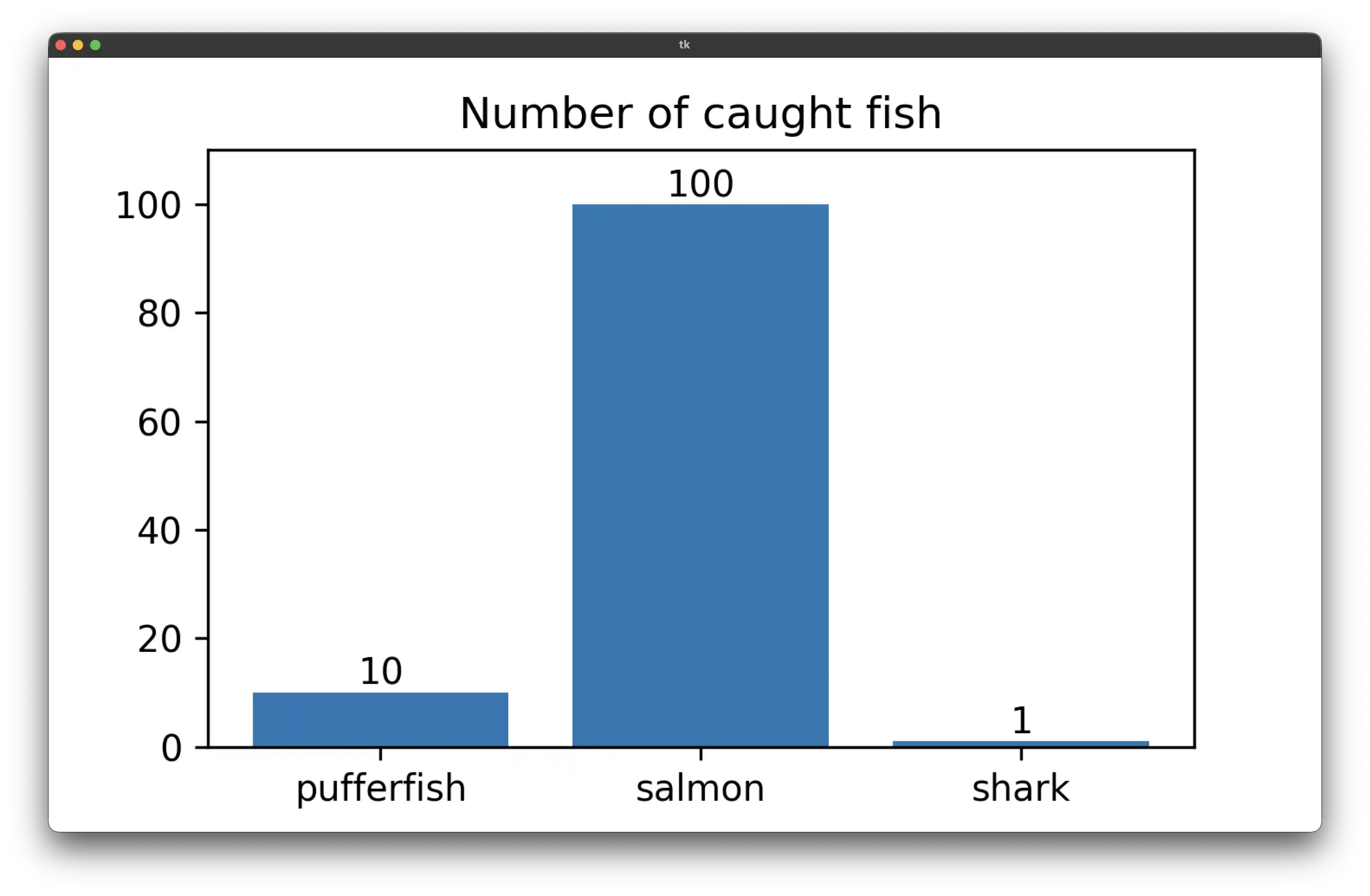
bar_container = ax.bar(df.fish, df.quantity)
ax.set_title("Number of caught fish")
ax.tick_params("x", rotation=0)
ax.set_xlabel('')
ax.set(ylim=(0,110))
ax.bar_label(bar_container, fmt='{:,.0f}')
root.mainloop()
Prerequisites
You will need matplotlib and tkinter to follow this tutorial.
Install matplotlib
To install matplotlib run:
pip install matplotlib
Install tkinter
tkinter comes with Python. If it is not installed on your system, follow these steps:
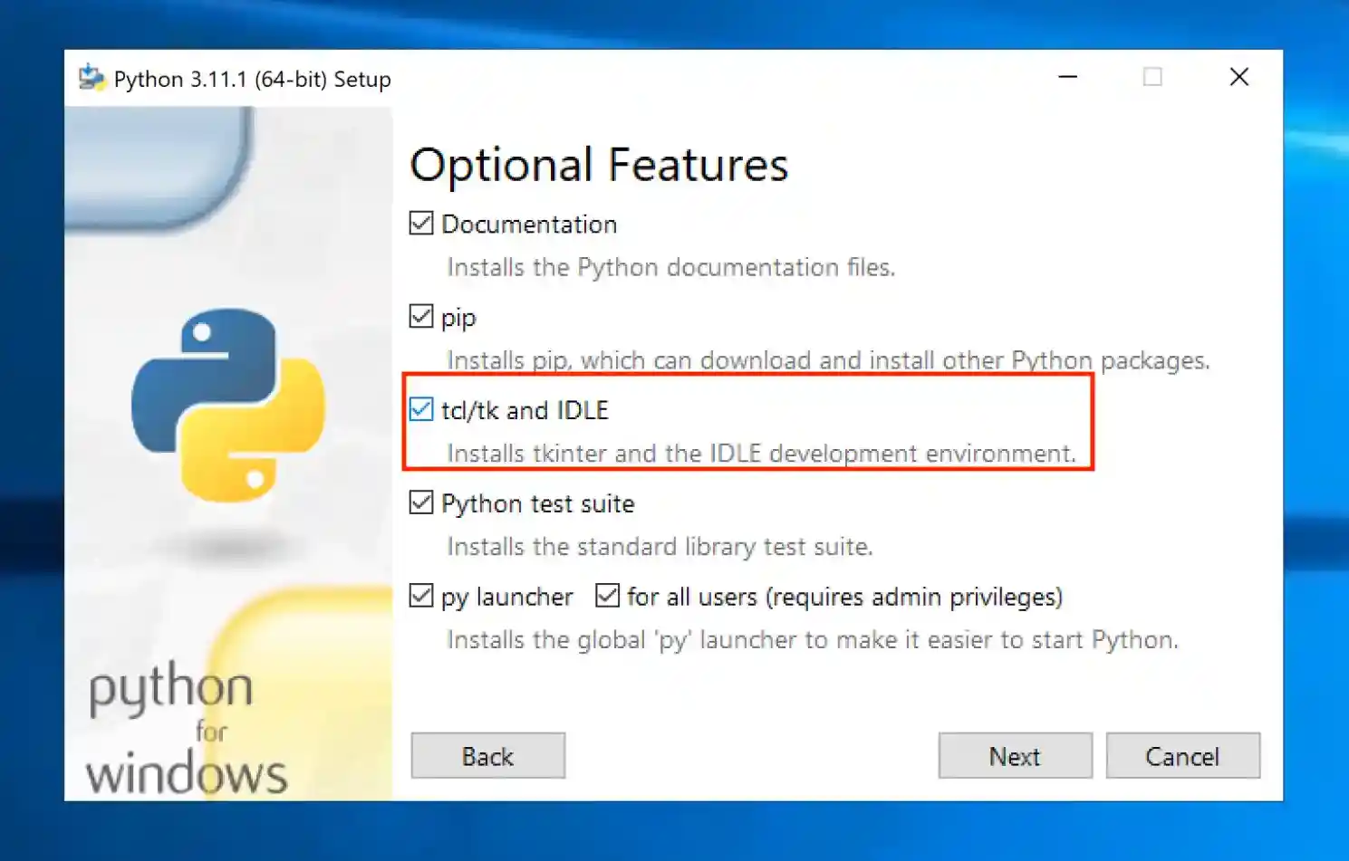
Windows:
Reinstall and customize Python.
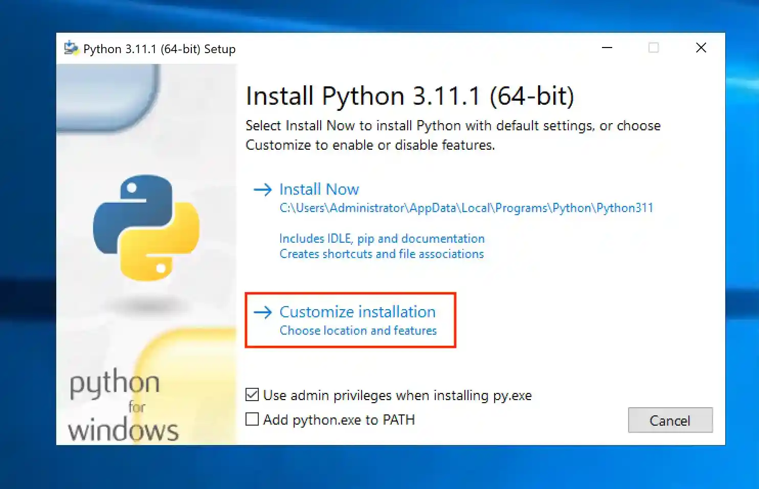
Make sure that the checkmark for tcl/tk is set:
MacOS:
Run the following command to install tkinter:
brew install tcl-tk
Similarly, on Linux run:
pip install python3-tk
Step-by-Step Example
Let's create a script that opens a window that holds a chart. The following will walk you through all steps.
Example Data
Prepare the data that you want to plot.
import pandas as pd

data = {
    "fish": ["pufferfish", "salmon", "shark"],
    "quantity": [10, 100, 1]
}
df = pd.DataFrame(data)
The Root Window
Before you can place widgets (elements such as charts), you will need to create a root window. The following code creates it:
import tkinter as tk

# create the root window
root = tk.Tk()

# code that creates objects inside the root window goes here

root.mainloop()
The Widget
Next, create the widget/chart and place it in the root window:
import matplotlib.pyplot as plt
from matplotlib.backends.backend_tkagg import FigureCanvasTkAgg

figure = plt.Figure(figsize=(6, 4), dpi=300)
ax = figure.add_subplot(111)
bar = FigureCanvasTkAgg(figure, root)
# get the tk widget and pack it into the root window
bar.get_tk_widget().pack(side=tk.LEFT, fill=tk.BOTH)
bar_container = ax.bar(df.fish, df.quantity)

ax.set_title("Number of caught fish")
ax.tick_params("x", rotation=0)
ax.set_xlabel('')
ax.set(ylim=(0,110))
ax.bar_label(bar_container, fmt='{:,.0f}')
Launch the GUI
Run the script:
python run gui_chart.py
You should see the following window pop up:
Conclusion
That's it! You just created your first graphical user interface in Python. As a next step, you might want to learn how to create a GUI that handles user inputs.