How to Plot a Line Chart in Python using Matplotlib
In this tutorial, you will learn how to plot a line chart in Python using Matplotlib.
TLDR solution
import matplotlib.pyplot as plt

x_axis = [x1, x2, x3, ...]
y_axis = [y1, y2, y3, ...]

plt.plot(x_axis, y_axis)
plt.title("title name")
plt.xlabel("x_axis name")
plt.ylabel("y_axis name")
plt.show()
Step-by-Step Example
Step 1: Install the Matplotlib Package
If you don't have Matplotlib already installed, execute the following command in your terminal:
pip install matplotlib
Step 2: Load the Data into Lists
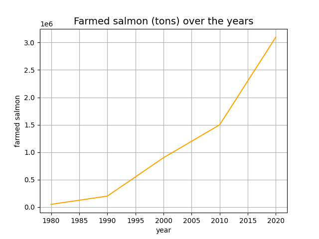
Let's say, you have the following data on farmed salmon in metric tons over the years:
| year | farmed_salmon |
|---|---|
| 1980 | 5,0000 |
| 1990 | 200,000 |
| 2000 | 900,000 |
| 2010 | 1,500,000 |
| 2020 | 3,100,000 |
Create a Python list for each column:
year = [1980, 1990, 2000, 2010, 2020]
farmed_salmon = [50000, 200000, 900000, 1500000, 3100000]
Step 3: Plot a Line Chart
Last but not least, plot the line chart using the following code:
import matplotlib.pyplot as plt

year = [1980, 1990, 2000, 2010, 2020]
farmed_salmon = [50000, 200000, 900000, 1500000, 3100000]

plt.plot(year, farmed_salmon, color="orange")
plt.title("Farmed salmon (tons) over the years", fontsize=14)
plt.xlabel("year")
plt.ylabel("farmed salmon")
plt.grid(True)
plt.show()
The resulting chart:
Bonus: How to Create a Line Chart from a pandas DataFrame
Similarly, you can plot a line chart based on DataFrame as follows:
import matplotlib.pyplot as plt

data = {
        year = [1980, 1990, 2000, 2010, 2020]
        farmed_salmon = [50000, 200000, 900000, 1500000, 3100000]
}

df = pd.DataFrame(data)

plt.plot(df["year"], df["farmed_salmon"], color="orange")
plt.title("Farmed salmon (tons) over the years", fontsize=14)
plt.xlabel("year")
plt.ylabel("farmed salmon")
plt.grid(True)
plt.show()
That's it! You just learned how to create a line chart using Python.